- Home
- Gallery and Artists
- About BAMM
- Members Area
- Resources
- Prompts from the Pros
- Prompts from the Pros - Sophie Robins
- Prompts from the Pros - Rachel Davies - Interwoven
- Prompts from the Pros - Lawrence Payne
- Prompts from the Pros - Alex McHallam
- Prompts from the Pros 2 - Escape with Bonnie Fitzgerald
- PftP2 Francesca Busca Eco Artivism - Fabric
- PftP2 Francesca Busca Eco Artivism - Metal
- Prompts from the Pros 2 - Francesca Busca Eco Artivism - Paper
- Prompts from the Pros 2 - Francesca Busca Eco Artivism Plastic
- Prompts from the Pros 2 - Joanna Kessel
- Prompts from the Pros - Helen Miles
- Prompts from the Pros - Julie Sperling
- Prompts from the Pros - Kelley Knickerbocker
- Prompts from the Pros - Marian Shapiro
- Prompts from the Pros - Rachel Sager
- Materials & Techniques
- History of mosaic
- BAMM Talks and Demos
- Useful links and groups
- Suppliers
- Prompts from the Pros
- Workshops/Exhibitions
- News
- Suppliers
British Association for Modern Mosaic
Prompts from the Pros 2 - Joanna Kessel
Joanna Kessel - Playing With Colour
November 2020
This Prompt from the Pros (PftP) is about Playing with Colour. It’s about observation, looking, learning and developing an understanding of colour, how colours work together and how we relate to them - our responses to colour are deeply personal. As the title suggests this PftP is about play and I want to encourage you to have fun exploring your colour palette. We’ll start with a walk, look at local plants, get some paint out, rake through our mosaic stores and then make a series of miniature mosaic tapestries.
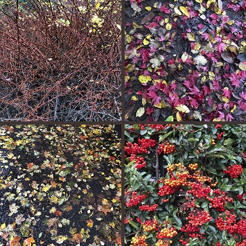
Playing with Colour will focus on plants for inspiration. Nature is accessible to all of us, whether it comes as a wild landscape, local park, hedge full of berries, a tree dropping its leaves or the promise of spring buds. Colours found within nature are hugely varied yet always seem to work well together, so the colour palettes we make should be contain some great harmonies.
I would like to encourage everyone to use tapestry and woven structures as the format for our miniature mosaics. This simple, repetitive modular structure is one I personally love and will enable us to focus our attention on what is happening within the colour palette. There are many interesting similarities between mosaic and tapestry, both are constructed from multiple units to create a whole (stitches in tapestry and tesserae in mosaic). A range of materials can be used in both media, creating unique qualities, wool and unglazed porcelain are matt and light absorbent whereas silk and smalti are shiny and light reflective. Experienced weavers twist together yarns of different colours and materials to form a thread of a particular character, similarly mosaicists will juxtapose them to create subtle shifts and nuances to the mosaic surface.
For some this structure might feel too restrictive or fiddly, you’ll either need to work through this or create your own format to apply the Playing with Colour concept to.
So let’s get going and start Playing with Colour…
1. Head out for a walk and look at the plants in your locality - Start small and focus in on the detail - enjoy being close up to what you are observing and explore the nuance of the colours in the leaves, twigs, berries and plants in your neighbourhood. (If you are struggling to see your surroundings afresh then try pretending that you have travelled to a place that you’ve not visited before - we always look in greater detail when exploring a new environment).
I suggest you take a small sketchbook, coloured pencils or watercolours with you, it’s a great way to familiarise yourself with what you are looking at. Your drawings don’t need to be botanically accurate just quick scribbly sketches that capture the essence of the colours. Recording in this direct way enables you see what’s there, rather than miss it by imagining what you think you see. There’s a big difference!
Document what you are looking at with photographs too – they are great for reference and even better if you get them printed. I photocopy mine to A4.
Finally collect one or two items that you’ve been looking at to take back to your studio / workspace. You’ll work directly from these inside.
In Scotland, whilst the autumn is still just evident most of the leaves have fallen - look closely at the ground beneath the trees, these currently look like whirly patterned pub-carpets - the dark, shiny mud is strewn with multi-coloured leaves. To record this pick up some of the leaves, make a smear of mud in your sketchbook and take a photo.
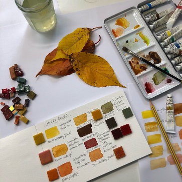
2. Study your plant material – when back inside lay out the objects you have collected on a white sheet of paper. If you’ve done some sketches open up your sketchbooks and select some of your photos and get them printed / photocopied. Now you are ready to look more closely and start making notes and colour swatches to help you determine the colours within your objects.
Things you may wish to consider when studying the colours of your objects are; the colour range, shade, tone and quantity. Assess if they are bright and intense or muted earthy colours, if they include many shades of one colour or are multicoloured, if they are tonally light or dark and try to approximate the ratios - how much of one colour there is in comparison to another.
On another sheet of paper make written, drawn and colour notes. These could include; simple sketches recording the shape of the objects and the position of the colours, a description of the colours you see, e.g. warm mustardy yellow and what the objects look and feel like, if they have any markings, are mottled, smooth, textured or spiky. Note what you observe and what is of particular interest to you.
3. Playing with paint - The best way to really ‘see’ the colours you have before you is to experience them, in this case capturing a likeness in paint. I find watercolour is a quick and easy medium to use but use whatever works for you - coloured pencils, gouache are also good.
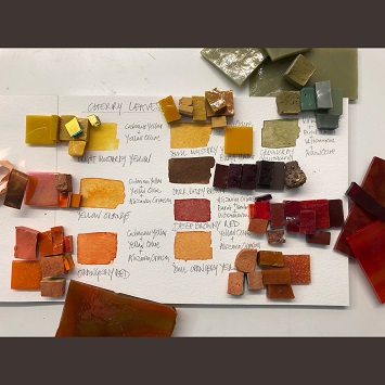
Mixing colours can be complex and I end up making lots of dabs of colour as I work towards the right shade or tone of a colour. When you have captured a particular colour, ring or mark it, and note which tubes of paint you have used to make it. This saves having to remember the mix and informs you how the paints work together. I find this process fun and informative, it requires time - skill comes through practice.
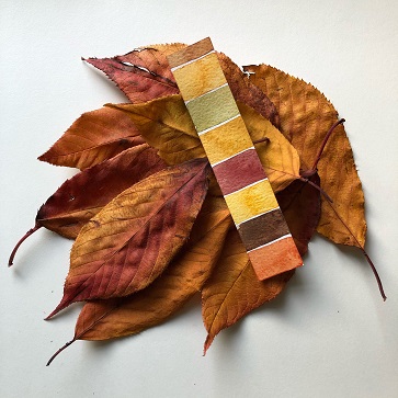
4. Create your colour swatch and strips - When I have captured the full range of colours within the objects I apply these to a separate main colour palette and 1 – 2 colour strips (similar to those you get at a painters and decorators shop). I use watercolour paper as it’s robust and holds the colour well. I note a description of the colour (dull orangery yellow) and which paints I used to create it (yellow ochre, alizarin crimson), if you’re sending it to a supplier numbering them can be helpful (e.g. dull orangery yellow - No 7).
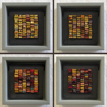
5. Explore your colour palette – start by drawing a square (smaller than 100 x100mm) and divide it into 6 columns. (Our miniature mosaic tapestries will have 6 columns). You could use graph paper or draw a grid on watercolour paper. I have a sketchbook with squared paper that I like using. (I’ve just noticed that my demos have 8 columns – hmm!?)
A flat ended brush is perfect to apply your paints, it creates a little rectangle that corresponds to the tesserae.
To start consider your colour palette and think about what interests you and devise a design plan to get you started. There can be infinite variations and this is a quick way to work through ideas. Remember this is about play so use this stage to experiment freely. Here are a few suggestions to try out;
- Light and dark tones – this could involve a tonal shift or you could add in some highlights in contrasting tones, light on dark, dark on light
- Select a key colour that speaks to you – using this create a calm design then create a design with energy by adding harmonious or contrasting colours
- Select a different key colour and repeat
Think about placement and the effect that dropping in a contrasting tone or colour has on the colours around it. Think about proportion, how much of any one colour / tone you need to make the design work. (e.g. yellow can be really intense so you may only need the tiniest amount within your design, or need to balance it with a large amount of other colours). Consider focal points and the placement of the colours, does this help your eye move around your design? Does the placement and the colour relationships make the design more arresting? If it does, consider why, if it doesn’t then don’t use it and try another combination. Make notes alongside, they can be useful at a future stage.
As you work on your designs you’ll develop an understanding of how your colour palette works and you may find that you naturally move away from your design plan – use your gut instinct and make the colours sing!
We all respond to colour differently and there is no ‘right way’, even though there a many colour theories. I suggest you spend time with this process and employ both your critical powers and gut response.
Generally when the colour palette is right, in my eyes, I get excited about the combinations and how they work together - I get a good feeling, if I don’t then I know it isn’t there yet and have to keep working at it.
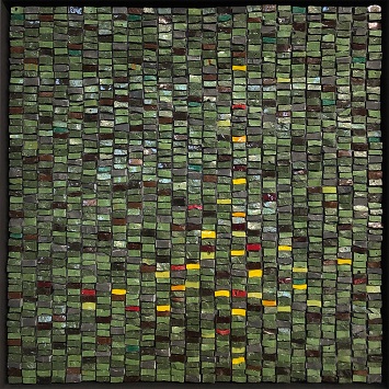
For my cherry leaves project I made a couple of drawings then moved on to work with the tesserae, which adds a whole other level to Playing with Colour.
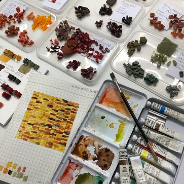
6. Source mosaic materials - I have a large stock of materials in the studio so I didn’t need to order additional ones but you may need to. If you have a colour chart to refer then you can check the codes and order your colours, if you don’t have a chart then post a colour palette strip to your supplier and ask them to match the colours. You may need to have a discussion with them.
I used one of the colour strips to source materials on the studio shelves and then checked these off against the main colour palette by placing them on top or alongside the paint.I cut off small samples of the materials I wanted to use to keep as a reference on the main colour palette – you could glue them on.I find it useful to do the colour matching during the day when I can use a mix of daylight and artificial light.
I found the most satisfactory way to approach the project was by using a variety of colours and materials to represent one single colour.I like the variation of colour, tone and texture as it adds depth to the palette.I was also thinking about how tapestry weavers combine yarns of different materials (silk, linen, cotton and wool) to create subtle nuances.
For my cherry leaves project I used the following range of materials; unglazed porcelain, vitreous glass (including old Bisazza glass), smalti, piastrina, gold leaf mosaic, Emaux by Albertini, stained glass, Litovi, marble, terracotta and fire clay (local beach find), recycled pigmented Jesmonite (left over from a previous work) terracotta tiles and copper tape.
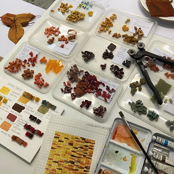
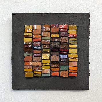
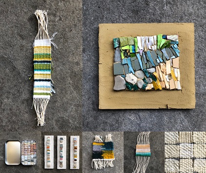
7. Prepare your tesserae - Once you have established which materials you are going to use, you need to cut them to size. I used a lot of smalti and the tesserae measure approx 6-10mm wide, this set the dimensions for the tapestry ‘weft’ columns. The height and depth vary depending on the material - I like to use a variety of different sized tesserae as it adds interest and movement to the mosaic. Cut a small supply of all the tesserae you are going to use so you don’t have keep stopping to cut when you start laying them out.
![]()
8. Make your first miniature mosaic tapestry – The dimensions I have set out comprise 6 tapestry weft columns at 11mm each (including space for the interstices) totaling 66mm wide. Draw out a few 66mm squares, marking the vertical centre lines, extend these so they are visible beyond the square. The tesserae in columns 3 & 4 will sit either side of the centre line.
For these small mosaics I place the tesserae on paper first and when complete I transfer them onto the adhesive and mesh support. Even though I base my mosaic on a design I know that I like to work intuitively, exploring the expressive potential of the colour and the material, the piece evolves as I work on it.
Place your paper on top of a piece of sturdy card. Using tweezers place your tesserae on the paper following your design, I start at the top of the left column and work down then move to the next column and so on.
Either follow your design rigorously or use it as a starting point and let the piece evolve, use which ever method you feel more comfortable with.
If you view these miniatures as a series of exploratory samples and experiment as you make them, you’ll learn a lot about the colour / material relationships.
Once you’ve completed one piece take a moment to assess it then start on your next one, the first may well inform the second and so on. Note the date, plant and location on the reverse of each piece.
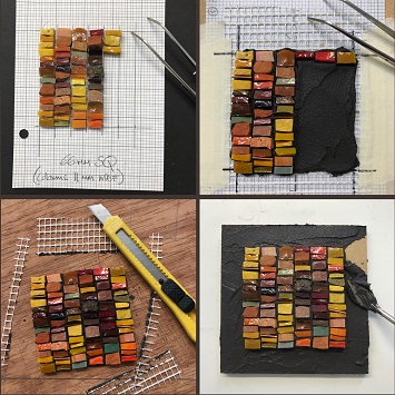
9. Sticking your mosaic onto a mesh substrate – Take one of your sheets of paper with a 66mm square drawn on it, draw over the lines with a dark felt pen so they are easily visible. Tape this to a board and tape a slightly larger square of clear plastic over the top, leaving a minimum 10mm gap beyond the lines. On top of this tape a square of mesh, again making sure the tape is not close to the lines. You may need to re-draw the lines on the mesh to make them easy to see, include the centre lines.
Place the tesserae you have laid out alongside the mesh, so your design is insight and the tesserae are easy to transfer.
I have used a charcoal black adhesive as it allows the colours to radiate, reminiscent of stained glass. I use a white powdered cement based adhesive and add 5% black pigment. It is easier to mix the adhesive with the pigment in a large batch rather than for each individual piece, use a small, lidded tub to mix it in (this helps reduce the airborne powder). For 1 kilo of adhesive use 50g of pigment. You could also experiment with other pigments.
Pour a little water into a cup and spoon in enough adhesive so it forms a thick paste, mix well. Apply a thin coat over the whole square (go up to but not beyond the perimeter line) press the adhesive into the mesh, then build up the depth so it comes about 1/3 up the height of the tesserae – they need to be embedded in the adhesive.
Start by laying out the top row of tesserae (columns 3 & 4 are placed on either side of the centre line) to get your spacing right. Start at the top of the left column and work from top to bottom, repeat for the adjacent column and so on until you finish in the bottom right corner. You may need to add or remove some tesserae as you go. Finish by carefully trimming away any excess adhesive around the edges before leaving the mosaic to dry over night.
10. Finishing off and framing your mosaic - When dry remove the tape from the mesh and plastic layers, flip over and peel the plastic off the mesh. (If you are going to make more mosaics then tape the plastic back in place and add another layer of mesh etc).
Place your mosaic on a cutting mat or board and trim away the excess mesh from your mosaic using a craft knife. The next stage is to mount your miniature mosaic tapestry and you’ll need a 100mm square board for this. If it’s ply or mdf you’ll need to prime the front and edges with 50:50 pva:water. When dry draw diagonal lines from corner to corner and place your mosaic centrally over these, if it’s square the corners of your mosaic should touch the lines leaving equal space around. Once it is centered draw around it with your felt pen and remove it. Spread a thin layer of adhesive onto the board within your lines and stick your mosaic down. Complete the piece by covering the rest of the front and the edges with a thin layer of the same adhesive, leave to dry.
I have completed my miniature mosaic tapestries using a painted tray frame, the internal dimensions measure 110 x 110mm (creating a 5mm shadow gap). You could keep your mosaic as a sample un-mounted. You could also work directly onto a board if you prefer.
Thank you for participating in Playing with Colour – In Scotland, as we move from autumn into the darker days of winter, I look forward to seeing how people have responded to the prompt and the colourful miniature mosaic tapestries you produce.
If you have enjoyed the prompt then you might like to revisit the concept each season and create a year long record of the colours of your local flora. Make sure you note the date, plant and location on the reverse of each piece.
Your miniature mosaic tapestries could also go on to inform a larger piece (of infinite scale) or you may simply wish to apply this newly gained colour knowledge to another mosaic design you have.
Tapestry: The Light Within – is a slightly larger an artwork I created in 2019. It evokes the form of a woven tapestry – an image created through the structural interweaving (the warp and the weft) of coloured yarns. The work references medieval woven tapestries, often representing woodland hunting scenes predominant in blues and greens, with a ground strewn with brightly coloured flowers.
The repetitive cellular structure of weaving and images built up out of multiple units has fascinated me for a long time; this structure underpins many of my mosaic artworks. There is an obvious correlation between the bead, or stitch, of tapestry with that of an individual tessera, here the andamento echoing the linear structure of the warp. Colour in tapestry, like mosaic, cannot be mixed and is achieved through juxtaposition and materiality.
In Tapestry: The Light Within the light refers to the glow of the petals of the red and yellow flowers carpeting the dark, dense pinewoods of Classe on the outskirts of Ravenna. The glimmer of light within the darkness hints at dawn, and the potential of a new day, suggesting a hidden light within – referencing self-awareness, perception and a joyous delight in creative expression.
This artwork was shown in the international mosaic biennale Ravenna Mosaico in 2019.
Background information
I studied in the Ceramic and Tapestry departments at Edinburgh College of Art and the Royal College of Art, London and whilst I don’t work directly with either media now this training left me with a deep-rooted interest in the tactility of materials, working with my hands and a fascination in constructed, repetitive modular structures. These formats often appear in my artworks.
I run an annual Mosaic & Tapestry summer course in Italy with my colleage Laura Magliveras, we both trained at ECA. Our next course will be in 2022. This year we were due to have a change of venue and run it in Kefalonia but for obvious reasons had to cancel it.
You can read more about these and the Mosaic Workshop Programme I run from Edinburgh Mosaic Studio on my website. The 2021 programme will go live before Christmas.
If you’d like to keep in touch and hear about upcoming workshops, exhibitions and mosaic related events then please sign up to my eNewsletter via my website and follow me on Instagram and Facebook.
facebook.com/joannakesselmosaics
![]()
![]()